Lack of Culture

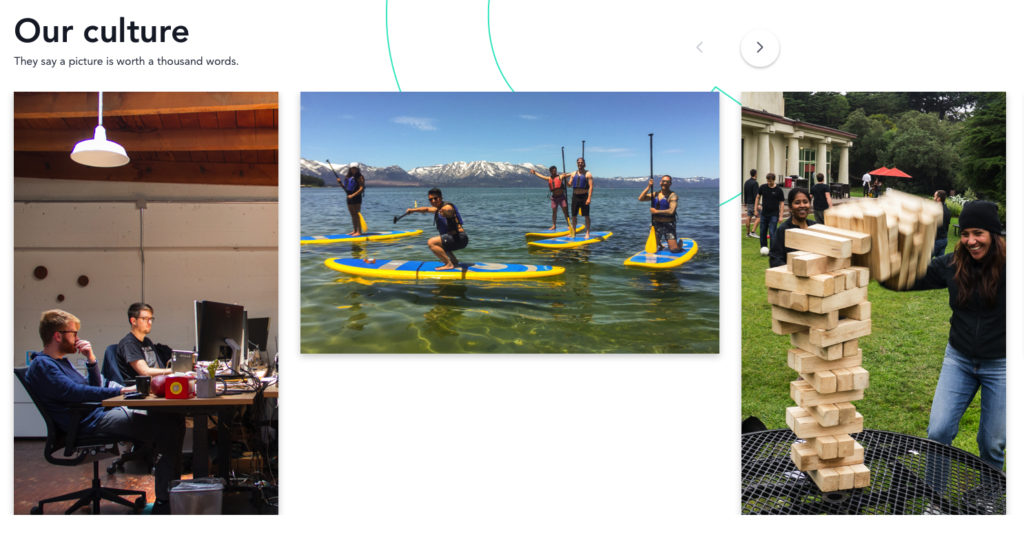
This is the “Our Culture” page for a new company we stumbled upon yesterday.

Someone in marketing was tasked with communicating how great it is to work  there, and how much fun they have when not working (which used to be a thing you took care of yourself, right?). From the “gallery” of images, it appears that their “culture” revolves around spending quality time in their windowless shared-office space looking at screens, paddle boarding and spending gray afternoons outdoors playing Jenga.

I hope Jenga isn’t one of their signing bonuses. A far cry from those $6k bikes everyone got last year.


It also seems they’re missing the currently, totally acceptable promotion of office drinking that is the signature of this decade.

They could have even combined the two for not that much more money.


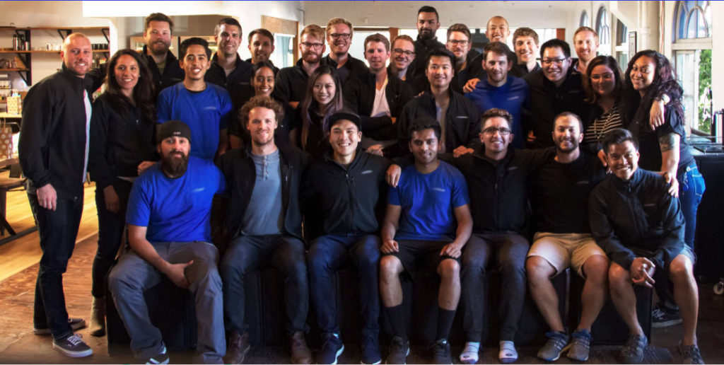
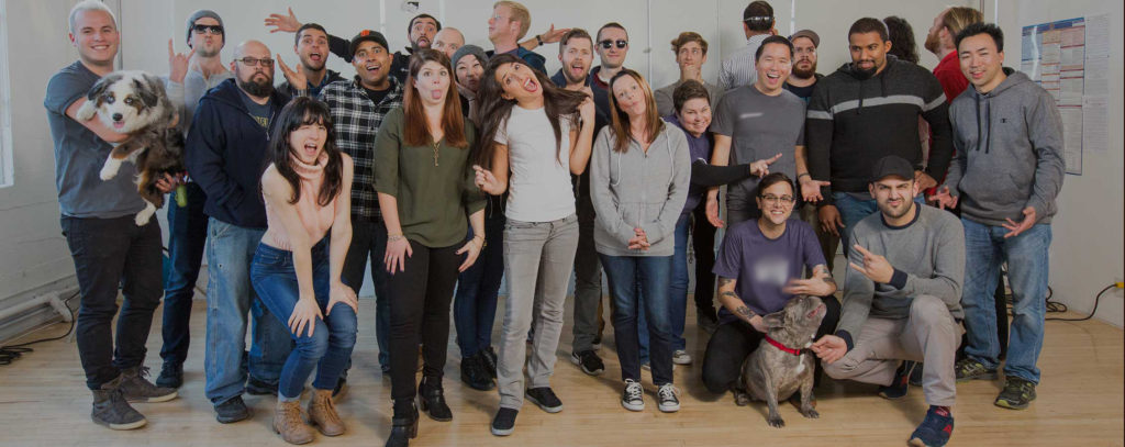
And what about the ubiquitous group shot? What do these really communicate to would be applicants? Don’t bother applying unless this is your first foray into the workplace since college? Everyone who works here gets a free (hopefully) company branded shirt/hoodie/fleece, which you WILL enjoy wearing to company events (daily) and group photo ops.

And the casual tone hints that it’s not going to be too different from dorm life. Some of us are just “wacky”, but the rest of us are really boring. And you can bring your dog. Well, only upper management can bring their dogs, but you’re cool with that, right? You can just pay someone else to take care of your dog back in SF, while you spend 16-hour days here in the Valley.

Ultimately, these “our culture” pages are meant to attract the best software engineers they can get, and maybe a few other wellness directors and happiness coordinators.

It makes one wonder how well they understand the engineers they already have. Are they still motivated by the weekly Jenga contests? Does the foosball table have a thick layer of dust on it? Surely they could do a better job of attracting top talent.

Ultimately, the concept that a photo gallery of amateur phone pics would be sufficient in communicating the benefits of working for this company is insulting.

Here’s one that hits the mark, touting a great quality of work/life experience over the life of the career.

Consider what really motivates one to go to work, day after day? Free coffee? The same t-shirt as everyone else? Jenga? Or maybe it’s as simple as job satisfaction.

Google CEO Addresses Hamburger Emoji Debate

From CNN Business…

Google’s version of the emoji on Android shows the cheese beneath the burger and above the bun. While the cheese placement isn’t new, a writer and media analyst started a debate that went viral over the weekend over whether or not it should be placed on top or below the burger.

“I think we need to have a discussion about how Google’s burger emoji is placing the cheese underneath the burger, while Apple puts it on top,” he tweeted.


read the whole story…

https://money.cnn.com/2017/10/30/technology/google-cheeseburger-emoji/index.html


Myth: Never Use Black

I hadn’t realized this was a trend, until recently. Apparently, a lot of people new to the world of design have fallen for this fallacy. They’ve heard it somewhere or other that it is a bad idea to use black in their designs.

Ian Storm Taylor maps out the thinking behind this movement….

https://ianstormtaylor.com/design-tip-never-use-black/

There are lots of great points here, but “never” is a bit extreme (I know hyperbole rules the headlines of our times).

A similar thread goes along the lines that Monet never used black, so neither should you. Monet, was a fantastic impressionist painter, who wanted to emphasise the richness of tones in shadows and contrating lighter areas, and thought that black dulled these sensations, and his paintings benefitted from this philosophy.

Monet was not a print designer nor a web designer, though I’m sure he would have been very capable.

Anders Zorn, also contemporary of Monet’s painting in Sweeden, use a very limited palette for many of his paintings, consisting of only yellow, red, white and BLACK.  He created greens from mixing yellow and black. All of the blues of the sky and water were in fact shades of gray. The lack of a true blue adjacent to all those other mixed warm colors makes our eyes (or brains) see the cool grays as blue. Try it some time. It’s freeing to paint with only limited choices. Really.

Black has also been a staple of print design throughout the ages. Consider it’s importance in Lissitzky’s posters. To say “never use black” sounds as absurd as saying “never use red” or white, or any other color. (Don’t start me on the subject of black and white not being actually colors. We’ll get into that in another write up).

Paul Andrew at Speckboy.com has rounded up some contemporty examples…

https://speckyboy.com/black-web-design/

Another Andrew, Kelsall, has spelled out the various types of black designers use, and some common pitfalls…

http://www.andrewkelsall.com/the-professional-designers-guide-to-using-black/


Desire Paths Reveal Where We Really Want to Go

A year ago, or so, I was walking through the Panhandle and noticed that someone had created a “creative” twist in the path on the way to the playground. It seemed awkward, at best. I wondered what purpose it served.

Perhaps the boulder placed within the bend was meant to remind us of the gold seekers of the 1800’s crossing over the Sierras?

It didn’t take long for the people of the neighborhood to vote their disapproval with their feet.

This Summer, the path in the Panhandle got a new surface, but this flaw was not corrected. However, someone in the parks service did observe it’s use and has sprinkled wood mulch on top of the user-formed pathway.

We won’t have long to see what happens when the rains begin.

Also curious that the new path surface is completely flat and is not porous. A lot of other municipalities are using permeable pavings to prevent flooding, and in cases where impervious surfaces are employed, they are often curved or slanted so that rain runs off. Neither were used in the Panhandle. Probably not a big deal this year, but this path always gets new contours and potholes due to all the ancient tree roots running beneath. In a year or so, it will be puddles and mud-holes again.

Which is not great design, but I know the neighborhood pet duck (link tk) won’t mind a bit.

Here’s a great read by Kurt Kohlstedt at 99percentinvisible.com on how designers sometimes fail to see the best solution to meet users already established habits.

Least Resistance: How Desire Paths Can Lead to Better Design